In this article we'll discuss the Microsoft Excel histogram chart functionality that will graphically return the summarization of distribution on numerical data. A good graph can help you grasp data quicker and easier and so turning your Excel data into a histogram might be something you consider.
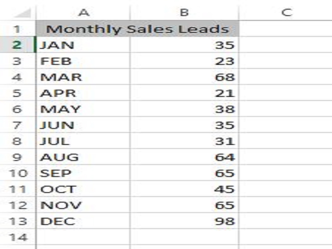
This tutorial will teach you how you can create a histogram in Excel. The image below is an example of numerical data in which it represents the frequency of the element in a specific range of cells and used when making a histogram chart.
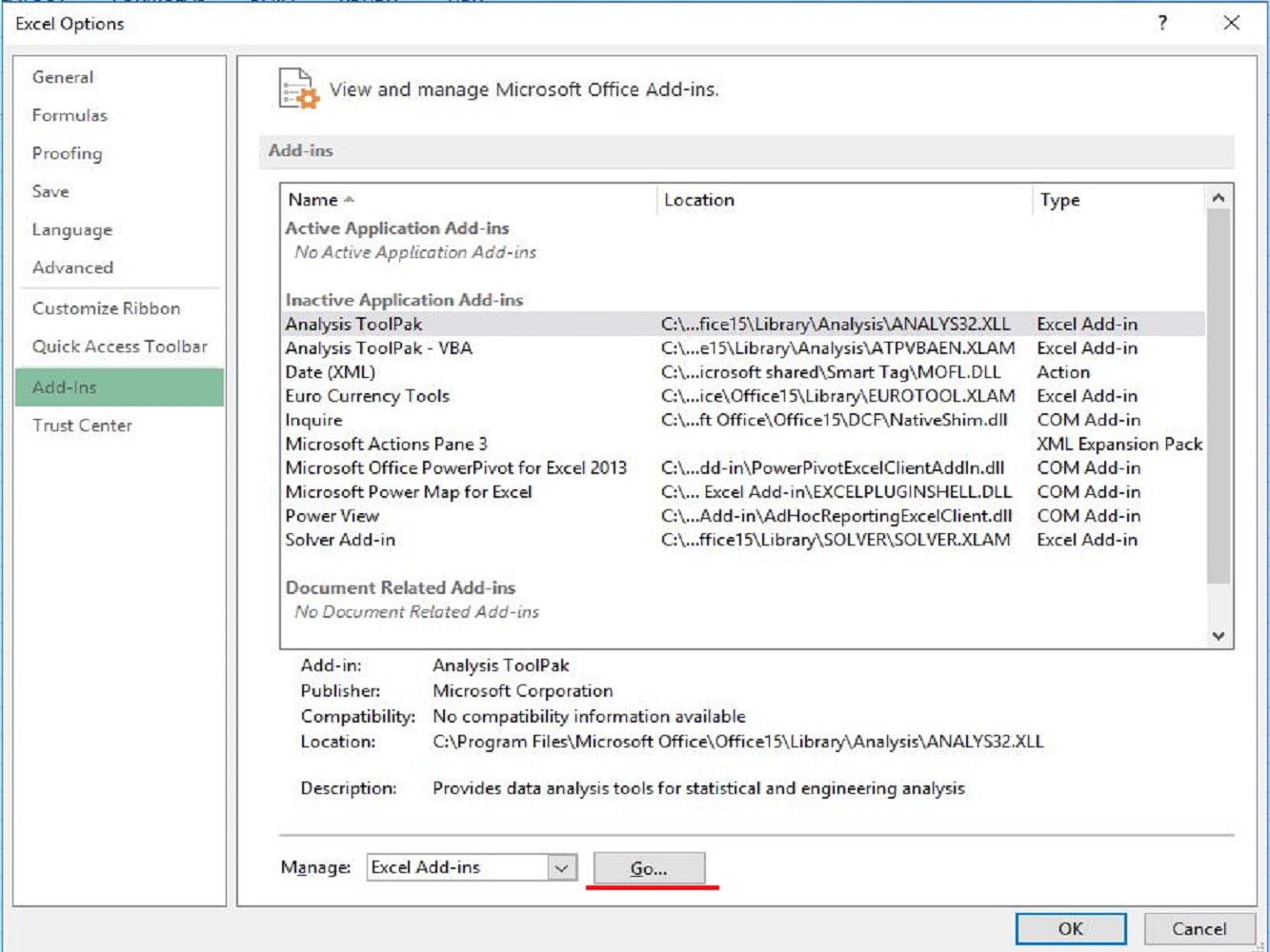
When starting up a Microsoft Excel workbook, it doesn't have a feature of data analysis at first because you will need to load up the Analysis toolpack add-ins. Follow the steps to load the Analysis toolpack and if you already have you can skip this part.
Before we create the histogram chart on Excel, we must first add the bins column for the representation of the intervals that will organize the group of the numerical data that needs to be sorted out and the intervals must be parallel, non-overlapping and typically equivalent in scale.
| Bins | |
|---|---|
| 20 | |
| 30 | |
| 40 | |
| 50 | |
| 60 |
Now we can make the histogram chart for the representation of our monthly sales leads as an example.
The first thing you need to do is to click on the DATA tab and look for the Analysis group then select and hit on the button Data Analysis.
A dialog box will pop-up and you will need to look for the histogram then select it and click OK.
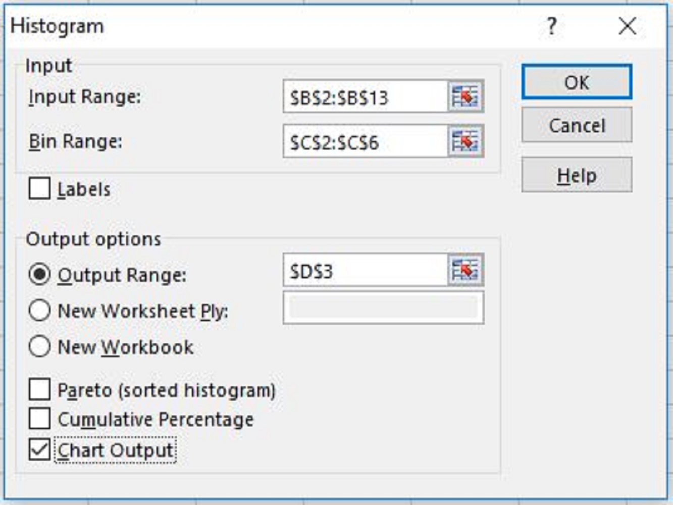
After that, another dialog box will pop-up then select the range of cells with the numerical data and the bin range data.
TAKE NOTE:

It automatically adds the frequency column that is divided by two with the total number of bins as shown in the graph. In this article, we have seen that our value of the monthly sales has a total of 5 frequency above the given bin of 60 sales per month.
Now you have learned how to include additional add-ins in excel that are used to create our histogram charts that represent the frequency and bins of the given example in our worksheet.
We hope this article will help you create histograms and other graphs from your data and give you better insight into your data for you and your company.