Often times visualizing data is important to increase the scan level readability by end-users. A bar graph is an excellent choice for many types of common data, typically when comparing different groups of data or looking at how data changes over time. Excel bar graphs are one of the simplest graphs you can make. Let's get to it.
A bar graph, also known as a bar chart is a perfect tool to visually show the types of data, such as changes in sizes, total differences, and the amount of volume. The bar charts may be horizontal or vertical; in Excel, the column chart is considered a vertical version.
To demonstrate how to make a bar graph in Excel, follow the step by step process provided below.
Step 1: Open the Excel File you want to make a bar graph or open a new file worksheet.
Step 2: Click the Blank Workbook that can be found on the top-left side of a window template.
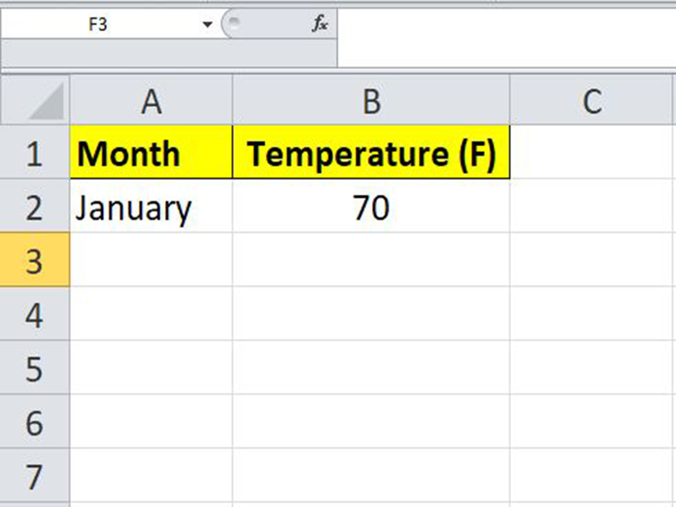
Step 3: Apply labels for the X- and Y axes of the graph. So, click on the X-axis on the cell A1 and type the label required, the same process for the Y-axis on the cell B2.
Suppose the bar graph is to show the high temperature per month.
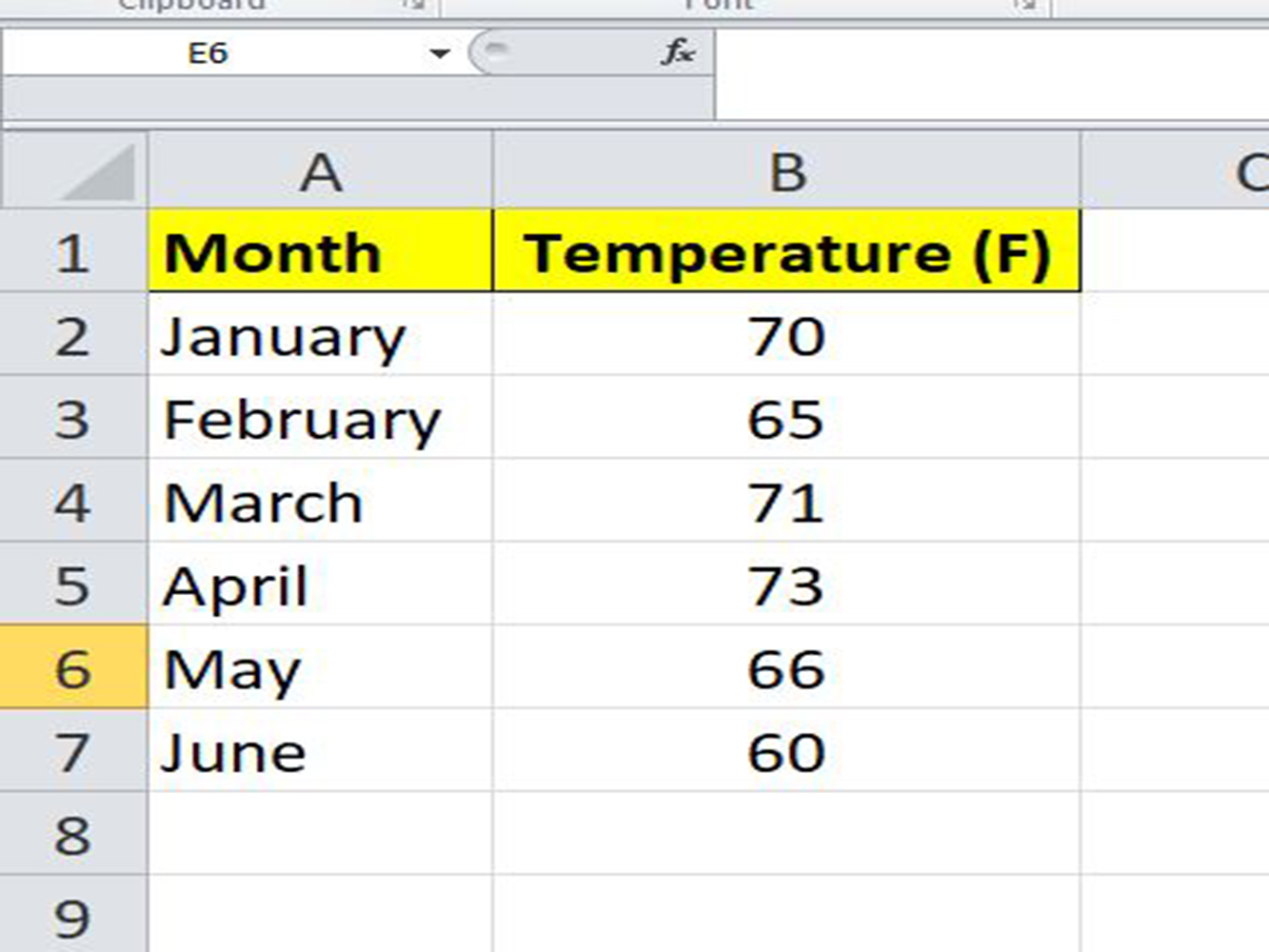
Step 4: Input the information required for the X and Y axis into cells A and B respectively.
Once you have done entering your data, you are now ready to use it to make a bar graph.
The next steps will show you how to make a bar graph.
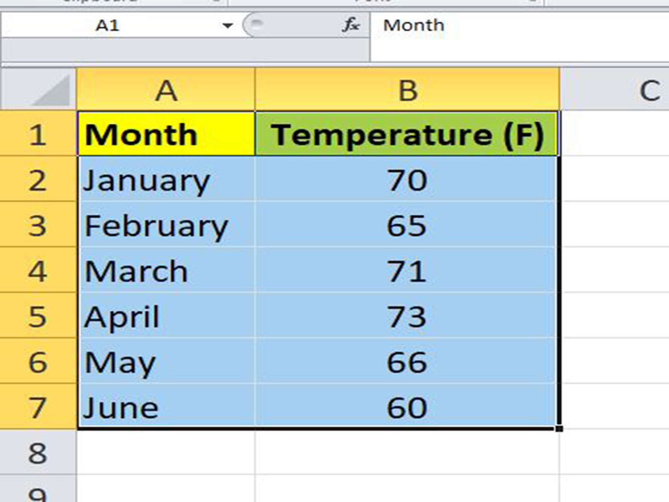
Step 5: Select the data in column A and column B. You can do this by clicking on cell A1 and holding down the Shift key then, click the bottom data in column B to select all the data.
You can also use your mouse to double click the left side of it then drag it to select the entire table.
Step 6: Go to the Insert tab.
Step 7: Select the Bar chart icon. This option is found on the category Charts below and in the right of an Insert tab; it resembles three vertical bars.
Step 8: Select the bar graph option. It can be any of the following:
2-D Bar option:
3-D Bar option:
Note: The templates will vary depending on your operating system.
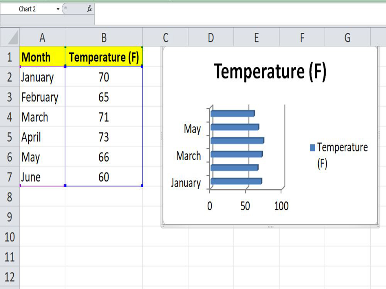
Step 9: You can customize the bar graph appearance. You can choose a different template, change the colors used, or modify the graph type completely by using the Design section.
Excel bar graphs are easy to make and useful. It is also possible to highlight the bar graph with on click, cut the graph from the sheet and paste it on another sheet. Dashboards are made this way and it is a highly effective way to increase the readability and formatting of the data.